Shell Finish Development -Summary of Colour Design

The finish of the ammonite is an important aspect of this model. The shell presents an opportunity to add a narrative to the design, which is a crucial aspect of immersive exhibitions.

To do this, I spent some time focusing on the colouration of the exterior shell. As mentioned in a previous blog post, there is a lot of conjecture in the geological community regarding the colour characteristics of ammonite. This is due to a lack of data – when fossils are uncovered, they do not reveal much about what colours were found on the creature.

However, informed guesses have been made by experts in this area. They have used creatures such as the nautilus and other molluscs for reference. They have also considered the environment the ammonite lived in, as this may also have had an effect on the colouration.

I used the research into this area to inform my choices during the colour design process. I started off by experimenting with base colours considering either warmer or colder tones. Afterwards, I moved on to explore specific colouration patterns in detail.

Key features and notes:

  • Cold base colour with warmer tones on top.
  • Contrasts with the puzzle pieces, which highlights the concept.
  • Defined pattern – the ridges of the shell are highlighted by different colours, with additional linework in dark brown. The latter adds additional detail to the design.

References:

Shell.

Key features and notes:

  • Pattern similar to the patterns of the nautilus – triangular pattern.
  • Reference from a pink shell for colour rather than the reds of the nautilus. More abstract/illustrated effect.
  • Two main colours – pink and cream. Very light colour scheme. Emphasises the dark blue of the puzzle pieces.
  • Is it too pink? Should it be more realistic in colour scheme?

References:

Pink queen scallop. [large shell]

White scallop. [small shell]

Key features and notes:

  • Same pattern as previous colour swatch, difference in colour tones. This design is more red-tone based, similar to the colouration of the nautilus. More organic/life-like rather than illustrative.

References:

Nautilus.

Key features and notes:

  • Simpler colour palette than the previous three designs. One tone – cream.
  • Pattern similar to second design, but less complex.
  • Simplified. Focus on the puzzle pieces.
  • Pattern will follow ridges – it will be darker in the deeper regions to add depth.

References:

Cream shell.

Key features and notes:

  • Monochrome colours.
  • Simplified.
  • Pattern less complex. Follows sculpted ridges in the model.
  • I could make it more organic by adding more colours, such as greens and browns. This would add to the narrative of the creature as it reflects the environment it would have lived in. The greens could represent discolouration due to moss, while the browns can define patches of deterioration due to age.

References:

Ammonite – artist representation.

Arctica Islandica shell.

Key features and notes:

  • The simplest colour and pattern design.
  • The pattern follows every few ridges.
  • More abstract/illustrated paint finish. Least realistic in terms of references to the colouration of actual molluscs and sister groups of the ammonite.

References:

Ammonite – artist representation.

Shell.

Key features and notes:

  • The base of the design is similar to colour swatch #5.
  • Addition of darker tones that follow the ridges of the ammonite more closely.
  • Addition of greens and burgundies for a more organic, life-like finish.
  • Cold undertone to the base colour which makes it blend too much with the puzzle pieces.

References:

Ammonite – artist representation.

Shell.

I would like to propose that the red variation of Colour Swatch #2 would be the most effective colouration for this model. It is based on an existing creature – the nautilus – which helps to ground the model in context. It will also help me during the painting process, as I will be able to refer to images of the nautilus to ensure the patterns and tones are correct.

Additionally, the warm tones of the external shell juxtapose the cold tones of the puzzle pieces. Through this definition, the interactive components are emphasised, highlighting the concept of water inside the chambers of the ammonite at the same time.

The soft tissue of the ammonite such as the head and tentacles, can have a similar colour scheme to shell #2 (red). Similar to the head of the current nautilus, it could be primarily cream with areas of red to match the shell.

Moreover, I would also like to use certain features of my other designs, such as the patches of green and red in Colour Scheme #6. I could add subtle tones of greens and browns to insinuate wearing down of the shell, thus adding further realistic context to the model. This will ensure that the finish of the model will not appear too illustrative/abstract.

Benchmarks for paint finish

Mechanism – Design Development

Diagram portraying the mechanism used to create a vertical motion of the ammonite

To represent the concept of ammonite buoyancy, the model will operate on an up and down mechanism. The ammonite will move and up down corresponding with its weight because of a spring. The effectiveness of this system depends on the type of spring, and how the model interacts with it.

What type of spring should I use?

Compression and extension springs = compressed/extended linearly which creates a force that opposes that motion.

For this model, a compression spring would be most effective. The model will be able to stay down when the puzzle pieces are inserted, and rise back again once they are taken away. The spring will also fit into the tubing which will act as a stand for the model.


Hooke’s Law (Elasticity. Torsion. Force)

F = -kX

F = force applied to spring

X = displacement of spring

K = spring constant (stiffness)


Springs have certain stiffness to them which dictates the amount of displacement that they will endure when a force is applied (Hooke’s Law). Choosing the correct stiffness will be vital for the model as it needs to be soft enough so that the puzzle pieces affect the weight of the model and make it sink. It must also be stiff enough so that the model can rise up again once the puzzle pieces are taken out.

The spring will also need to have high strength to avoid creep – very slow plastic deformation over time. Enough strength in the spring will reduce maintenance needs.


The ammonite will be attached to the spring using mirror fixings. This means the model will be able to be taken off the stand if needed for presentation etc. It also makes repair work easier – if the spring deforms over time and needs replacing, the model can simply be detached and the spring slid out from the tubing and replaced.

In summary, the vertical motion of the ammonite rising and falling is created through a spring mechanism that operates based on changes in weight. The mechanism is simple and requires minimal maintenance. Ultimately, the mechanism grants opportunity for interactivity with the model while representing the concept of buoyancy.

Development of Puzzle Design – Summary of Secondary Design Process

For the first few weeks of the project I was always prompting myself to think more broadly about potential designs for the model. After a while, I realised I kept coming back to the same idea, which I eventually decided to explore in more detail.

That said, I believe thinking broadly before deciding to focus on one idea in particular, helped me to consider far more perspectives than I would have otherwise. I believe it had an impact on certain elements of the final design, which were inspired by features I explored during the earlier stages of the design process.

What is the idea I chose to explore further?

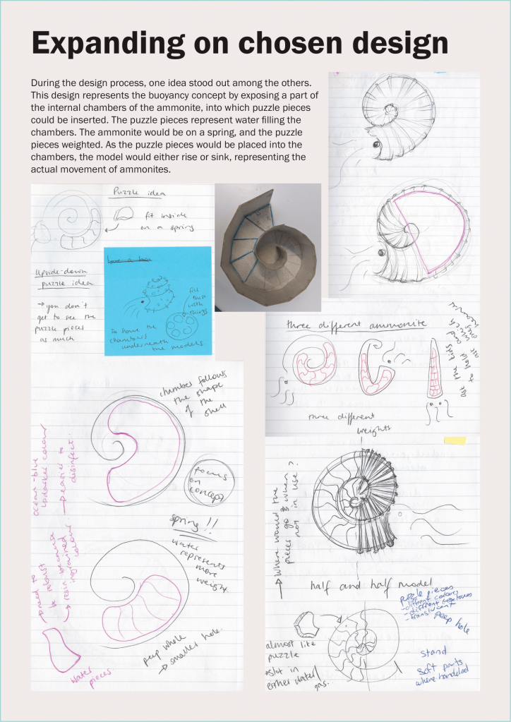
Puzzles! This design represents the concept of ammonite buoyancy using ‘puzzle pieces’ that slot into the chambers of the ammonite.

These puzzle pieces represent the water that would have gone into the chambers of the ammonite to make them either rise or sink. The ammonite would be on a spring and the puzzle pieces would be weighted. Placing the puzzle pieces inside the chambers would make the model sink by increasing its weight.

The model would also be placed on a spring, which would make it rise again once the puzzle pieces were removed. This represents the actual way that ammonites used water to influence their buoyancy system – they would fill the chambers with water to sink and take the water away to rise.

Why did I choose to focus on this idea?

The buoyancy system is quite an abstract concept and the model must be able to portray it in an accessible way for the audience. I believe the puzzle idea represents this in the clearest way from all my ideas. Additionally, I really enjoyed the interactive aspect – puzzles are games that most of us have experienced before, which makes them more relatable and simpler to interact with.

I also liked how there was the potential of adding an element of narrative to the design – I could develop the outside of the shell and the soft parts to give animalistic context to the concept. Elements such as texture of the outside shell, colouration, and positioning of the tentacles, could add a story to the creature as it would reflect the way they led their lives. To achieve this, I researched more into what could have been the colouration of the shell, and what the soft parts of the creature looked like.

What were the main elements of the design I considered during the process?

  • Shell
  • Soft parts (squid)
  • Chambers
  • Puzzle pieces
  • Mechanism
  • Stand

Shell

Some of the main questions I explored:

  • What shape should the shell be?
    Although ammonite shells took many different shapes, in the Kimmeridge area only ones with tight spirals were found. I briefly looked at how I could incorporate different shapes of shells into my design, but decided that due to the values of the museum, the tight spiral would be best. The Etches Collection places a strong emphasis on its local area, where all fossils from the museum were uncovered by Dr Steve Etches.
  • What amount of detail would I include on the outside of the shell?
    I had to decide between going for a more realistic look, or more of an illustrative portrayal. I decided that hyperrealism on the outside shell would not fit the rest of the model – the exposed chambers abstract the look of the model. Therefore, I decided that perhaps a more illustrative look would be best.
  • What colour were their shells?
    There is not a lot of data in this area considering ammonites. Experts hypothesise that the colouration of their shells could have ranged anything from pure white to orange with brown streaks. One thing that could have had a big influence on this would have been the environment that the ammonite lived in. This will be explored further in my upcoming post.

Soft parts

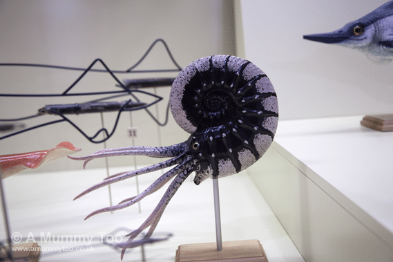
These include body parts such as the head, tentacles, and eyes.

Some of the main questions I explored:

  • What did the soft parts of the ammonite look like?
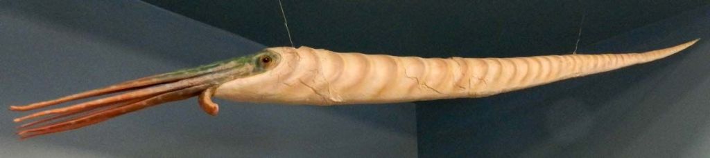
    There have been no fossils found of the soft parts of ammonite. Therefore, experts can only theorise what these looked like. Many look to sister groups of the ammonite – the nautilus and cuttlefish – for answers.

Chambers

Some of the main questions I explored:

  • How many chambers should be exposed?
    This model depends on part of the outside of the shell being cut apart to expose the chambers inside. The size of this area would dictate how many chambers and puzzle pieces would be in the model. I had to consider this in relation to the audience, and the amount of times they might want to interact with the model before their attention is lost.
  • Where should the shell be exposed?
    The placement of the exposed chambers was also important to consider. As the size of the chambers decreases the closer to the centre of the spiral you get, this would impact the size of the puzzle pieces. This would be important to the model, because the puzzle pieces would have to be big enough to facilitate enough weight so that the model could be weighted down enough to sink. The puzzle pieces would also have to be big enough to be handled easily.

    Additionally, I also had to be mindful of the fact that the beginning of the shell spiral houses the soft tissue of the ammonite (such as the head and internal organs). This means that the shell could not be exposed in this area, as scientifically, there would be no chambers in that place.
  • Half and half model?
    The shell would be split in half – equal amount of chambers covered and exposed. This could either be vertical or horizontal.
  • How realistic should the chambers be? Jagged/natural/abstracted?
    Exploring this question I was juggling two opposing ideas – realistic or more abstracted chambers. The former would mean the chambers would be far more complex, as realistic chambers inside ammonite shells curve and connect with each other – they do not follow a simple pattern. While this is beautiful, it will be too complex to make a puzzle out of. Therefore, a more abstract look might be more appropriate, as it would simplify the chambers, which would make the puzzle pieces easier to slot in and out. This will increase the effectiveness of the interactive element of the model.

Puzzle pieces

Some of the questions I explored:

  • How many?
    Related to previous question on ‘How many chambers should be exposed?
  • What material?
    I have been investigating using metal, resin, or silicon for the puzzle pieces. The metal pieces will provide the most weight to the model but might take the longest time to make. The resin might be the fastest material to work with, and I could add metal powder to the resin to increase its weight. Silicon would add an interesting tactile element that could also boost the immersion of the model. It would be the closest in imitating a liquid, as silicon is much softer than any of the other materials I was considering. Silicon might not add enough weight for the ammonite to be weighted down enough.
  • What texture?
    Rough, smooth, matte, or glossy.
  • What colour?
    These puzzle pieces could be any colour, from something imitating fossils to symbolising water. I believe blue would be the best choice as it links the closest with the concept I am aiming to represent.

    The shade of the blue might also be influential – I would like to stay away from very light/pastel colours, but dark blue would also not be a good choice as it represents deep water. The ammonite most likely occupied more shallow waters, so perhaps a mid-blue might be more appropriate.
  • Magnets?
    In order to increase ease of usage, I could place magnets in the chambers and puzzle pieces. This will not only increase the weight of the model which will aid the mechanism, it will also make sure that the puzzle pieces will stay in the chambers.

Mechanism

This will be detailed in an upcoming post. Stay tuned!

Stand

Some of the questions I explored:

  • Vertical or horizontal?
    A vertical stand and background would be more appropriate due to the nature of the model – it represents a concept of up-and-down movement.
  • Curved or straight?
    The background could be straight like a plank or curved, like the glass in some aquarium exhibits. Curving the background might make the model more dynamic, as it could relate the ammonite to its environment when it was alive.
  • Pipe or tubing?
    The ammonite could be attached to a spring which would be hidden inside a pipe. This would give an industrial/raw look, which insinuates the organic nature of palaeontology. It would also not take the focus away from the model and concept. Easy to transport. Easy to set up. Doesn’t take much space.

How did I explore these ideas?

While a large part of my design process was done through drawings and sketches both on paper and digital, I explored parts of this design through physical maquettes. These were made from greyboard and clay.

The greyboard maquette helped me to explore:

  • The size of the overall model
  • The shape of the spiral and how it spirals into smaller chambers as it goes internally
  • What the chambers look like – made me decide on a more organic look that wasn’t so jagged

The clay maquette helped me explore these ideas:

  • The size of the overall model
  • The shape of the shell – how one part of the spiral overlays the other
  • The look of the ridges on the outside of the shell
  • How much of the shell to expose
  • What would the chambers look like inside

Overall, the second stage of this design process focused more intently on investigating and bench testing different elements of one idea. Supporting my ideas was research on ammonites and on a variety of materials and techniques. Sketches were explored further by physical maquette models, and vice versa.

I had a lot of fun with this stage, especially while sculpting the shell of the ammonite! I am looking forward to studying the intricate details of the shells further during the sculpting stage of the model.

Stay tuned for an upcoming post portraying my final design.

Broad Thinking Stage – Summary of Initial Design Process

Sticky notes – Starting out designing the fun way.

Doing the research into immersive museums before starting the design process helped me to acknowledge all the different features I would need to consider for the model. Additionally, deciding what were the key benchmarks of the model, really helped structure my design thinking.

I started the design process by thinking broadly about the project. I thought about the different ways I could demonstrate the concept of ammonite buoyancy through an immersive design that would engage the audience in the narrative of the creatures, while increasing information retention.

Some of the first ideas I thought about focused predominantly on portraying the rise and fall of the ammonite as a consequence of their buoyancy system.

In the design to the left, the ammonite is positioned on a rod that would allow it to move up and down, controlled by levers. These are shaped like the helm of a ship to link the design into the narrative of the ammonite being in the sea. The model would have also been housed in a suitcase for easy transportation.

This second idea placed the ammonite behind a curved glass, similar to the ones that can be found in aquariums. This would insinuate the narrative of the creature being a sea animal, while also adding a playful narrative for the visitors who have visited aquariums beforehand. It would give context to the ammonite.

There would be a lever to the side of the model – turning it would move the ammonite up and down.

London SeaLife aquarium display featuring curved glass.

This design is based on one of the first models I made during the course – a simple wooden mechanism with a lever and two interacting elements. As you turn the lever, the two components interact and vertical movement is created.

I could use this design in my model to move the ammonite up and down.

I found that the lever was too constricting and would not have been engaging enough for the audience, so I began thinking about other ways that I could instigate movement in my model. It is at this point that I thought about putting the ammonite on a spring, which has a natural up and down movement.

I really liked the idea of the spring but started wondering how I would use the spring to create the vertical movement, such as by putting in extra weight to make the ammonite sink, and taking the weight away to make it rise. This is very similar to how ammonites controlled their buoyancy – they had natural chambers inside their shells which they filled with water.

I could simulate this extra weight through puzzle pieces that would slot into these chambers. If the ammonite was also on a spring, adding the additional weight would naturally bring the ammonite down, while taking the puzzle piece out would let it rise.

I was really intrigued by the idea of the puzzle pieces and the spring, which I decided to explore in more detail. I did this by creating a physical maquette of the idea out of grey board. This helped me to see the idea from a new perspective, and I realised it was very static. The puzzle pieces were to represent water, but the way the ammonite filled in their chambers was more fluid than the motion of slotting in puzzle pieces.

Greyboard maquette demonstrating how the shell would be split up into chambers. These would then have corresponding puzzle pieces that could be slotted into the chambers

With this in mind, I created a second physical maquette to explore how I could demonstrate how ammonite chambers filled up with more fluidity. I thought about having a mechanism that pushed material into the shell. In the image below, water is represented by the yellow paper balls, and I am pushing these further into the shell. I liked how this idea was more accurate to how the bouyancy system actually functions inside the ammonite shells. Please see below for three movement progress shots. For the full video demonstrating this please click here.

Image 1 – Material loose in the shell

Image 2 – Starting to push more material in
Image 3 – Material pushed in the furthest.

At this point I realised I became too engrossed with the puzzle piece idea and that I didn’t think broadly enough at the beginning. I wanted to avoid narrow design thinking which could potentially ignore crucial elements of the model that could make it more engaging and effective for the audience. Therefore, I went back and began thinking about other ways I could portray the buoyancy concept for The Etches Collection. Please see below for a collection of the sketches from this design stage.

During this broad design stage, I considered some very different ways I could explore the interactive elements of the model. For instance, I thought about creating a wearable model, such as a hat where the model would hang on a spring. I also considered creating a massive chair shaped like an ammonite, which would be situated on a movable platform. As more people sat on the ammonite chair, the platform and the chair would go down and vice versa.

I played around with some more abstract ideas involving scales and very simplified shapes. With these I wanted to focus purely on the buoyancy concept and tried to portray in the simplest ways possible. I was inspired by the experiment developed by Earthlearningidea. They used a water bottle and a testing tube to demonstrate how ammonites used to control their density and how this affected their buoyancy. These designs ensured that the concept was simpler to understand, however it got rid of a lot of the narrative that was part of the engagement of the model.

Moreover, I also looked into a game concept. I wanted to focus more on the narrative of the ammonite, specifically as to why they had to evolve a buoyancy system. To survive, the ammonites would have had to do two things – get food and escape from predators. Therefore, they needed a system that would let them move in the water, and as they did not have flippers, they developed this buoyancy system. To capitalise on that, I thought about framing my model around the idea of a game visitors could play. The ammonite would be attached to a fixed path, and the visitors would control how fast and how far the creature moves along this path. They would do this in order to help the ammonite get to food, or escape from predators.

In summary, this initial design process has emphasised the importance of engagement and narrative for me. It has helped me realise that there are many ways that this model could portray the concept of ammonite buoyancy, and it depends on the context of the exhibition which would be best. Overall, it has helped me to understand what elements I would like to focus on – I am aiming to highlight the physical vertical movement of the ammonite by engaging the audience. At the core of the brief is the movement concept, and if the audience is creating this movement, they are directly interacting with the concept, fulfilling the purpose of the model.